So the project was brought to me by a friend of mine, Sean, and it culmunated in digitizing Sean's lineart for the logotype and creating a tshirt for the band themselves.
Check the band out here!
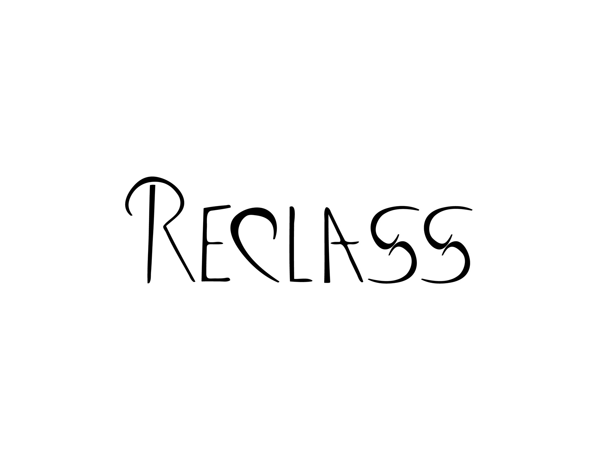
This is the digitized logo, it's a traceover of the linework by Sean, along with edited outline properties, giving it that really smooth look.
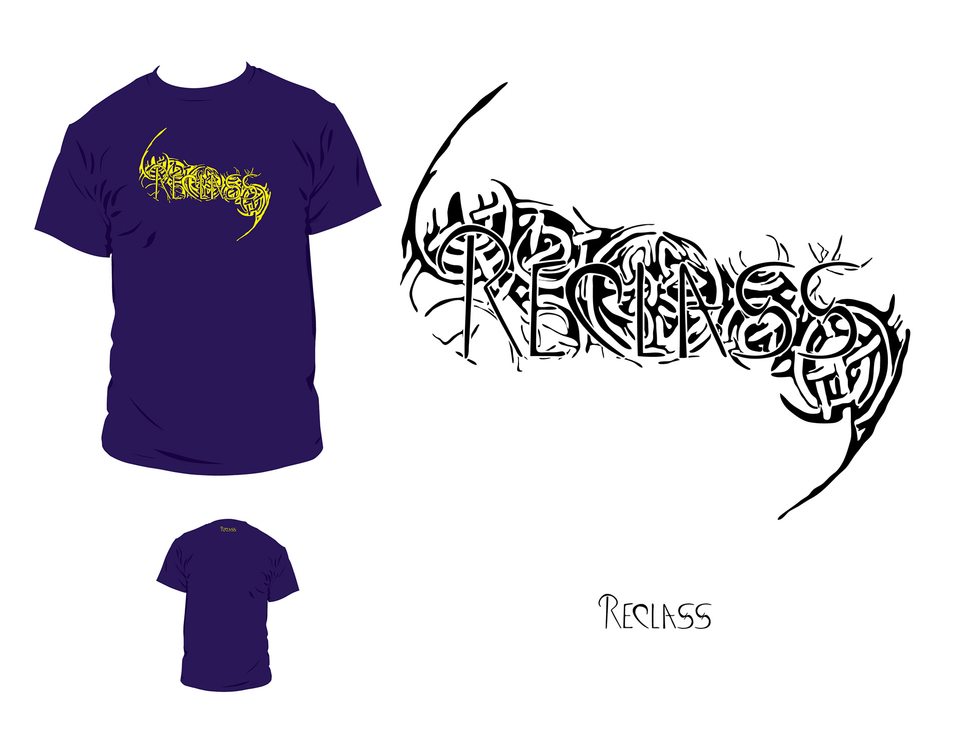
This is the finalized first proposal I did. The basis is the Celtic Knots being grown out of the Reclass logo, but legibility reasons required me to put in the whitespace outline around the logo. Still, pretty decently busy but readable.

This is what Sean first pitched to me in terms of design: a party scene with a couple drifting apart. Based on a single, the scene is representative to the James Bluntish song which all led to this design. I had to compensate the single colour issue with actually creating a legible and interesting scene. Hope it worked!
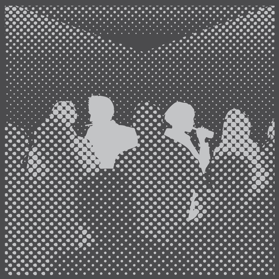
An actual blow up of the design for iTunes. Note: the nosering on the girl akin to the song.