A jam packed third year (2014-15) was a mix of going back to the roots of the orgaNization and refreshing the look and stylization. I worked a lot with reds and blacks, intermixed with splashes of colour to emphasize or exaggerate. I learned a lot and wait was a huge experience in terms of design. With lots of work over the year, here is but a snap shot into BrockTV, year 3.
Let me know what you think, and I hope you enjoy the gallery!
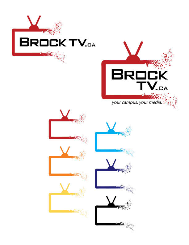
The Executive Director wanted to start of with minor changes to the logo from the previous year, so I did a reiteration of the TV breaking apart. This was the presented image showing off the logos in different colours, accompanied by full colour and body variants.

We also worked up some new branding material and business cards. The top images are an open house banner and business card. The business card was just a general one that we could hand out from anyone to anyone, as the ED wanted a more unified as well as casual approach. Also apart from certain producers, the cards are generally not used due to the close-knit student environment. Further down are equipment stickers to designate that they do indeed belond to the organization, a window banner, and proposed website changes, primarily a searchbar.

BrockTV gets shirts every year and these were my proposed pieces. The bottom one was the one that was selected. I tried more complex designs but ultimately retired to minimalistic fashion with high-impact in colours. The cyan ended up fantastic on the red.

The summer called for a lot of social media branding and small design work. I tried to keep the pieces varied but modular enough to be used in different cirumstances. I really like the "through the viewfinder" shot of Brock.

We also renamed the ISFF to the BSFF allowing us to push our brand through titling. I worked off the logo, added more halftoning and the certain static fuzz from a television to complete the design.
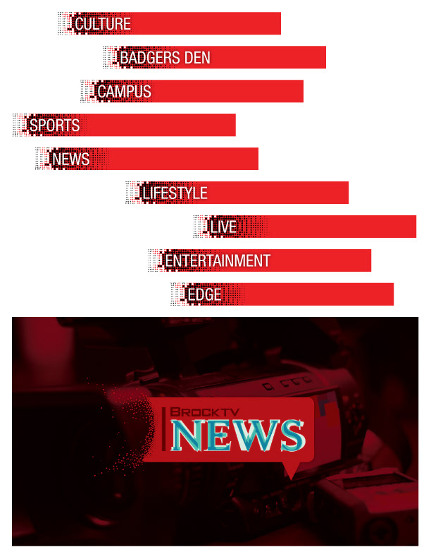
The website recieved some changes, primarly reverting backstage in terms of video distribution, provided that most of our content generated views through social media. We worked on some early changes but these fell my the wayside.

Badger's Den required few things, save maintenance. We worked a lot on our Livestream workflow, which was easily the biggest priority, catapaulting us into one of the most ondemand services in the university. On top of some awesome seasons by the Badgers, I think it'd be safe to call BDL a success this year.

I really wanted to make an animated banner for elections this year, so I did.

This year, like most, resulted in some posters for election period. We kept the work simple for this coverage.

A few new shows resulted in new branding opportunities, and I got to do up all the imagery for OFF THE AIR, all about talking with athletes behind the scene of their grand stage. The whole thing ended up being animated as a full intro to the show.

Badger's Survival Guide was supposed to be quick and sweet lessons on the ins and outs of Brock University for incoming, and some senior, students. I got to work on the intro opener, as well as the general brand work for the show.
A politics based talk show with some of the student leaders in the Students' Union. The lettering called for a professional look and pointed a very clean design. I really wanted to incorporate the countdown clock, and did with some relative success.

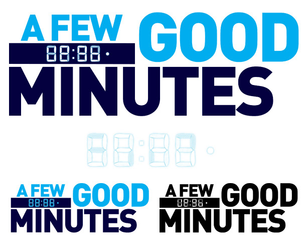
Probably my favourite show name from this year, and I jumped right to the design of a time clock. I wanted to originally focus primarily on the clock itself but the title seemed latched on. I redesigned the logo to be more sportsy (stars, stars are sportsy) and worked the animation so the reference from the clock to the title flows more smoothly. I really like how the smaller single coloured images turned out!

This was a fun logo to play around, primarily because of the simplicity of the title. In keeping I designed a simple intro to the show. A big thing people wanted was the implementation of the idea of people in either the logo or the intro, I opted for the intro, allowing the title to be minimalistic.
At the end of the day (or year I should say) it was an amazing ride, and allowed me to explore some new directions and figure some more of my strengths and weaknesses. In addition, I also worked on some video editing and brushed up on some old skills. I'm very excited to see what next year has in store!
Hope you enjoyed this gallery, check out the other years below.


