My second year at BrockTV (2013-14) was spent playing around with negative spaces and breadth of colours specifically. I wanted to build up my usage of different multitudes of colours in harmony, and trying to balance that resulted in edits, restarts, and most surprisingly: some valuable lessons. The year resulted in a huge heap of material, so this is but a snapshot into the entirety of the graphics developed. Hope you enjoy the gallery and let me know what you think!
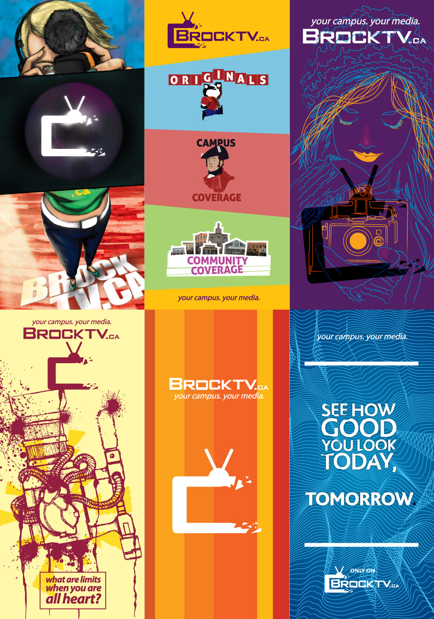
We at BrockTV go through a lot of banners. Sitting at 5ft each, the banners are all about attracting viewers and needed to be very colourful. I was pretty much given free reign and these were the results!

Badger Bomb was the drink special at the campus bar: Isaac's. The marketers for the bar asked us to create an animated intro, these are three keyframes from the animation.

One of the big pushes every year is the Independant Student Filmmaker Fund, the logo is from my first year at BrockTV. In addition, I also worked on some stickers promoting Hotspots, a series about highlight the hip student hangouts in St. Catharines. The blue and the white cards are rave cards we handed out during frosh week, helping promote BrockTV to ~17 000 students.
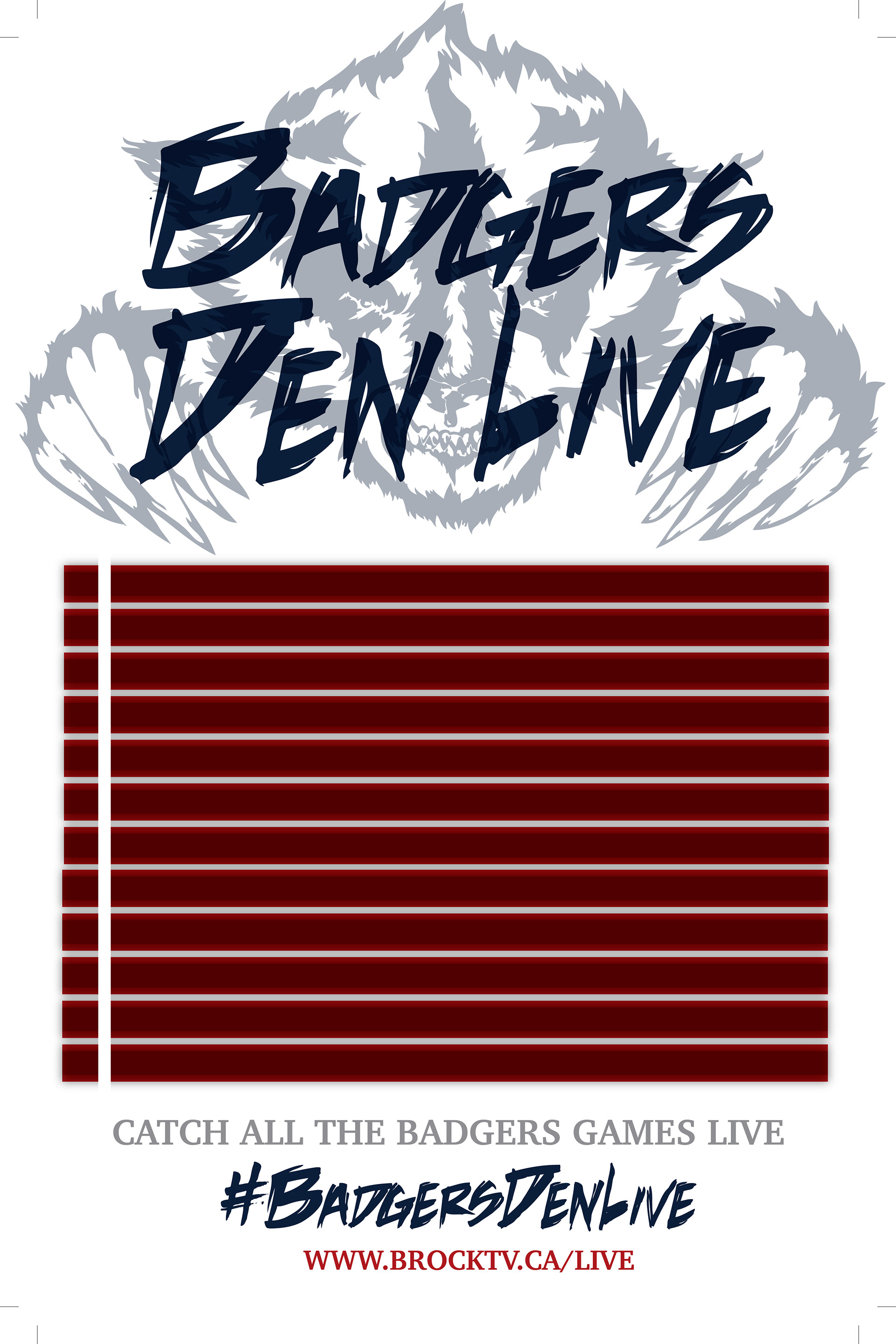
Badgers Den Live posters, with the red spaces being the base for match schedules text.

Badgers Den promotion was psuhed in two ways, with rave cards and posters both showing off the game schedule. The other feature of this is to bring together the Badgers Den Live logo and the official Brock Badgers logo.
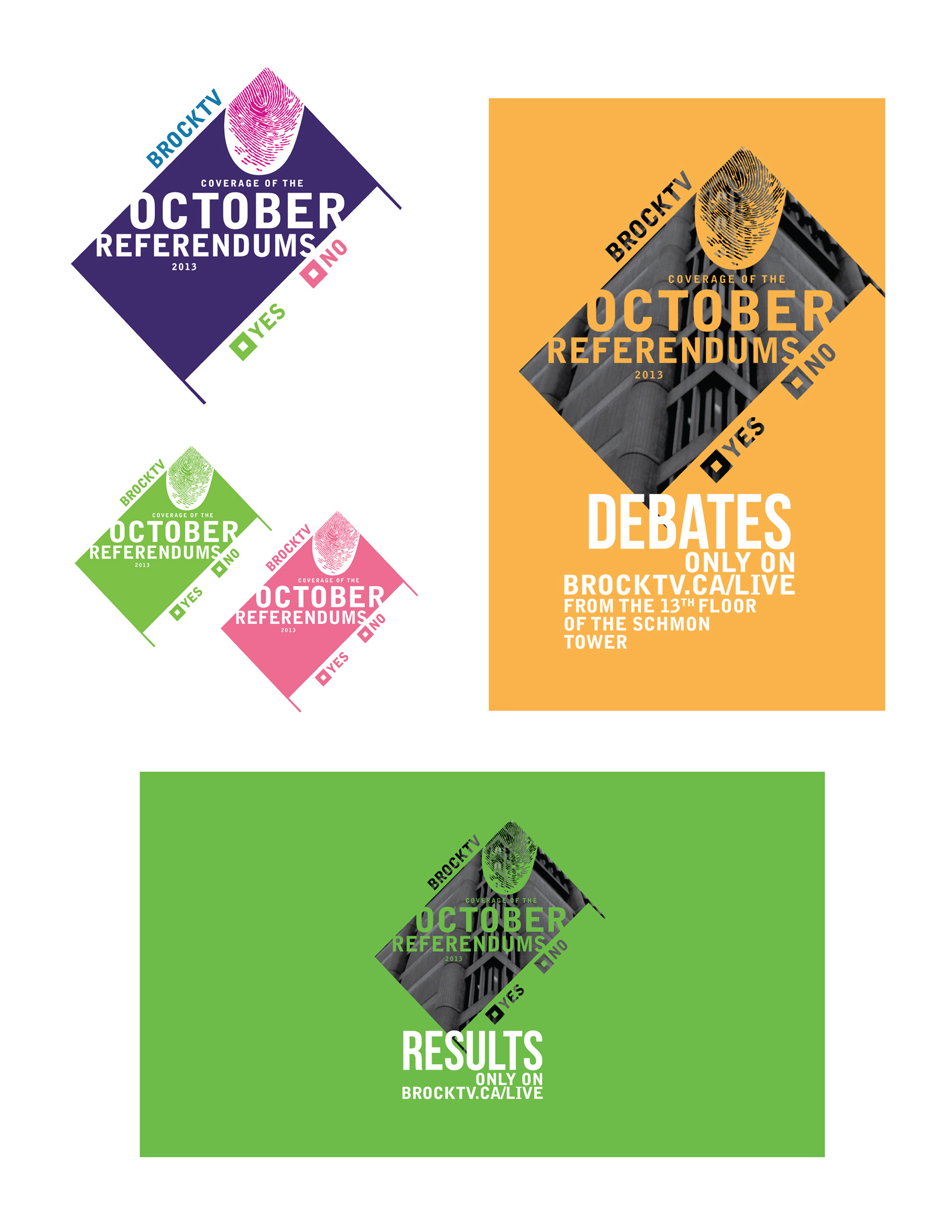
The colourfullness of the year carried on heavily into the election period. I wanted the logo to kind of be representative of referendum cards, since the year's politics involved a lot of big student decisions. I also wanted to incorporate the thumb print as it was used as Brock promotion, allowing me to draw the design of the electoral posters back to the school itself.
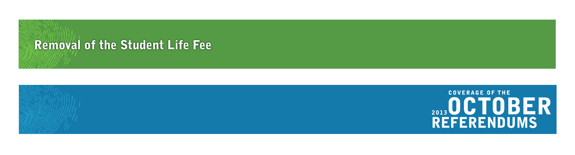
Lots of coverage of the referendums required us to put out lots of thirds, and cover statements regarding issues affecting many Brock students.
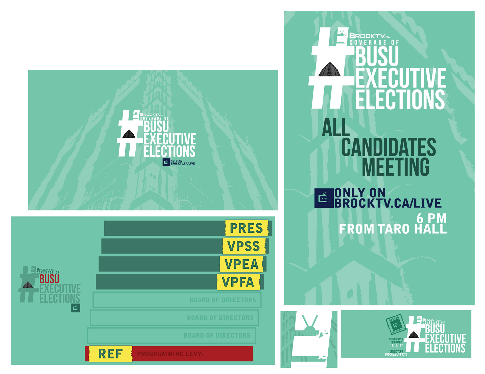
As Brock University has three annual electoral periods, the second one was all about finding the executive team for the next year. We kept similar design schemes, only changing the logo to a hashtag, reflecting the official marketing process. Otherwise we worked on background for the Livestream, info graphics, and social media elements.

Much of the summer was spent working on staff and volunteer shirts, trying to capture and reflect the corporate culture for the coming school year. The selected design is the blue and green one. I wanted to go a more graphic style, providing intrigue and catching eyes while on shoots. I included my favourite of the designs, the Marshall McLuhan one at the bottom right of the image.

While the image prior reflects the finished shirts, these are some of the original ideas I was throwing out to the executive director and marketing. The "Hand Crafted" one ended up being a Facebook cover. I focused a lot on cameras for most of my shirt ideas, settling on the DSLR.

It's kind of funny that the BrockTV website gets remade every year, and even with the same designer we completely redesigned it. A big thing I wanted to incorporate was the colour changing topbar for the website, allowing colourfulness to permeate in a generally black and white design.
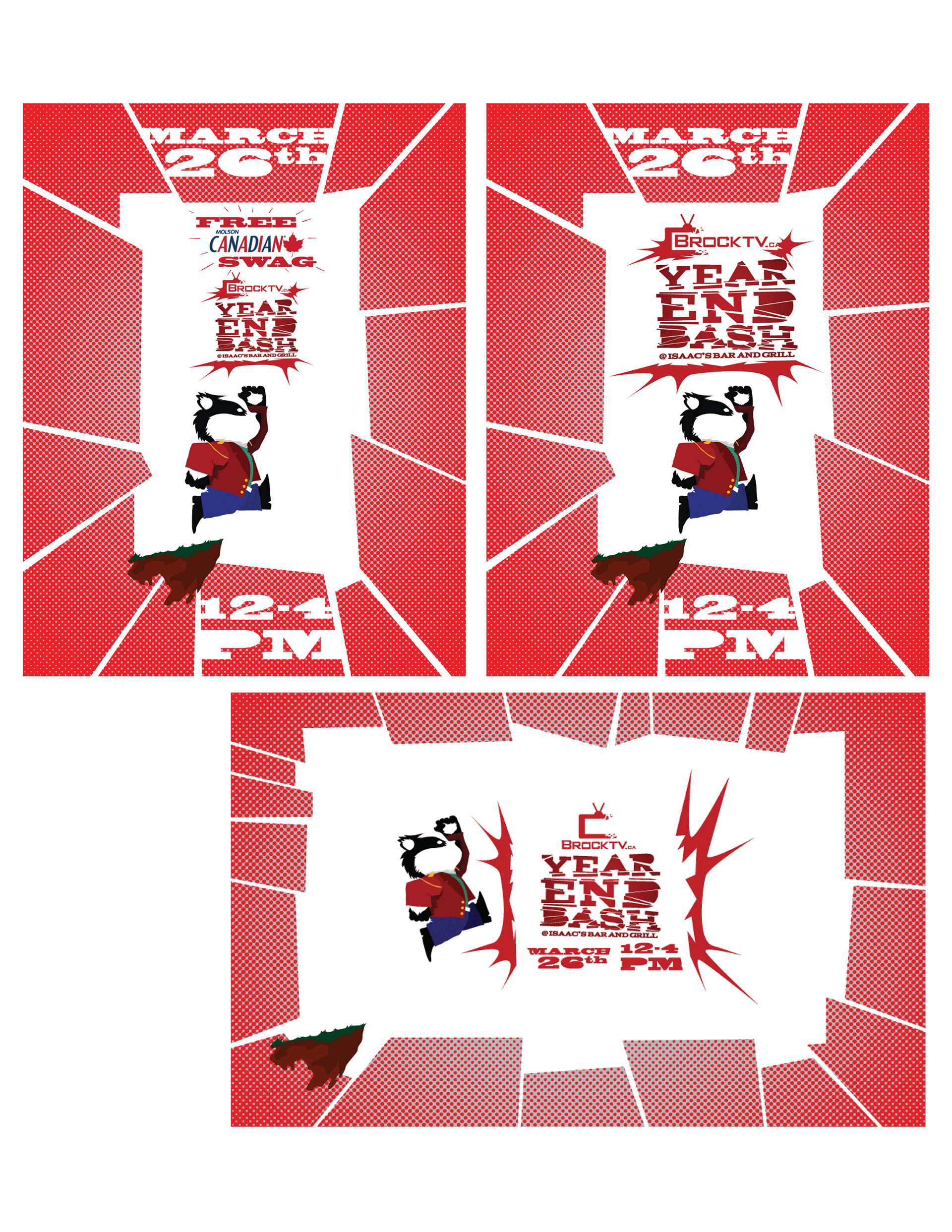
The year ended in style with BrockTV throwing a pretty rad end of the year bash, we ended up doing posters and social media material. The badger is from last year's BrockTV's Originals logo, but we loved him too much to not reuse him in something!
Thanks a lot for checking out the work I did at BrockTV in 2013-14! Let me know what you think! Check out the other years below.


