Much of 2012-2013 for me was spent balancing Brock university courses with my BrockTV employment. An important aspect of the year was the summer, the start of my contract, as the Executive Director, Marketing and I sat down to hammer out a fresher and more impactful image. With the year generating about 7GB worth of material, print and digital, I chose specifics to exemplify the overwhelming branding change experienced by the organization.

One of the first things I had to work on was the logo. The organization had an old saying, "Think Outside The Tube" which I appropriated into the logo itself, breaking the the words out of the TV image itself. The result was cleaner more legible logo, and ultimately a fresher brand.

The show categories were decided upon fairly early on, them being: Campus Coverage, Community Coverage, and Originals.

Sports at BrockTV was divided into two categories: Badgers 24/7 and Badgers Den Live. The former show reflected the humanistic portrayal of Brock athletes and their struggles with their respective professions. The latter was a show with similarities to Sportscentre, reaccounting the plays of the night and overall strategy of teams. This is a third for the program.

The Badgers 24/7 program intended to analyze Brock athletics more personally, looking at the athletes and their struggles. Therefore, the producer and I chose to go with designs that didn't necessarily feature athletes, but was more environment centric. This is one of the resulting posters.

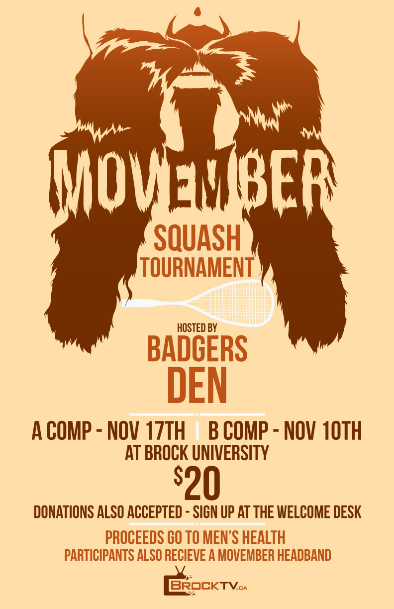
The classic sports coverage program, Badgers Den Live was designed to cover the latest in sports news, and as of 2014, we are growing by leaps and bounds due to our live coverage. Ultimately, this became the logo image for the show, the Brock Badger, stylized and rougher. A less idealized, more realisitic version for the coverage of games.
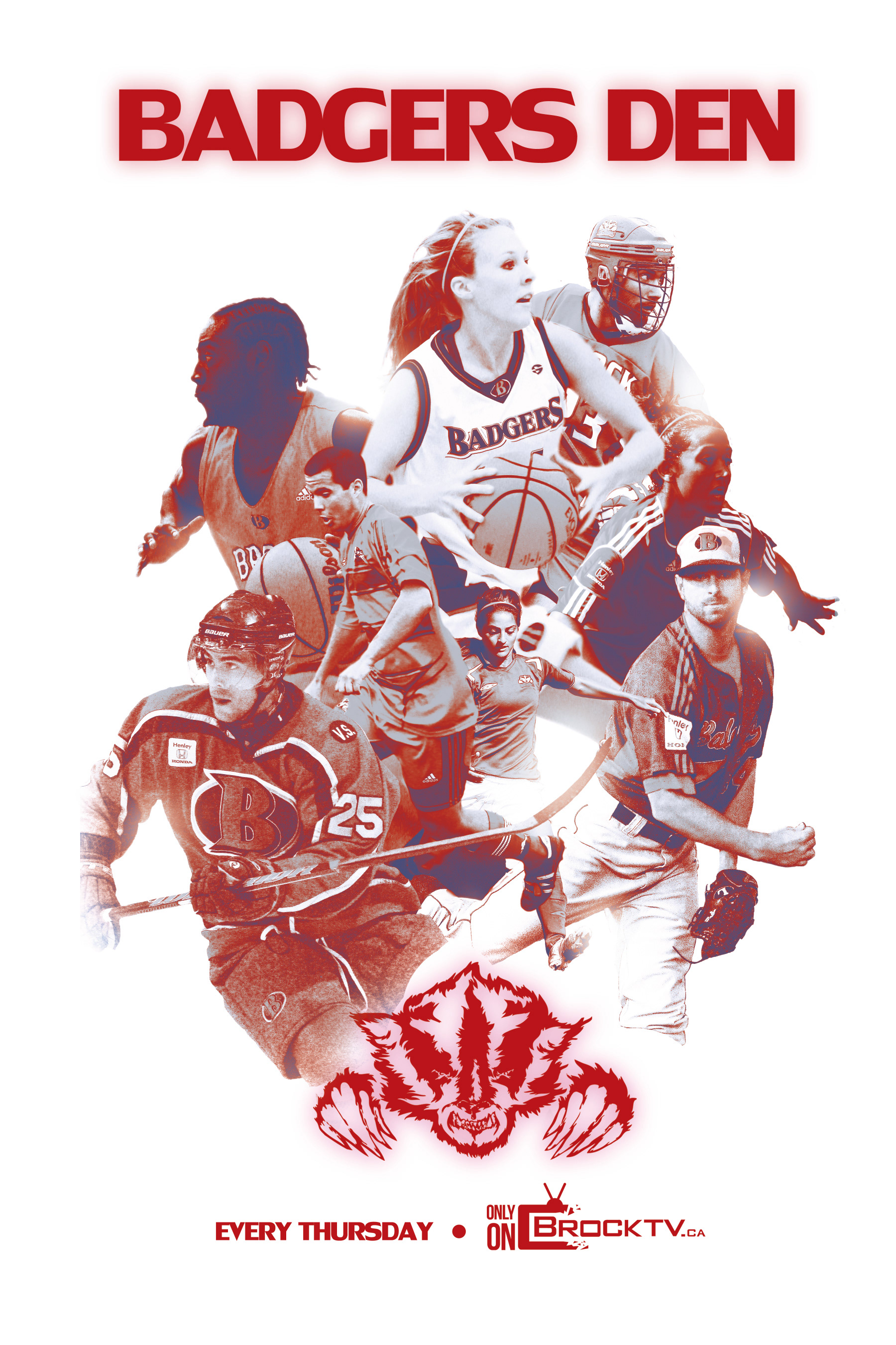
Very Sportscentre inspired, Badgers Den Live seeks to cover and report on Badger sports across the campus. This is the poster for the show.

Another huge push in the year was our social media presence, with more and more students being digital natives, it's fairly detrimental to continually market stuff only offline. It was also important to take the conversation online, because both Brock athletics, and especially Brock athletes had a fairly large online presence.

A big component of BrockTV was BTV Bands, covering Niagara's prominent music culture and featuring live shows from many indie bands. The producer of the show and I wanted to go a very "hipster" route, mainly trying to be as cool as possible. Since the topic is music, and cool definitely sells. This is one of the posters for the program.

A big thing the producer wanted to push was buttons, and these were the designs I went with. The first draft was a little too simple, so we continued to work on it.

A finalization of the buttons, the owls featuring speakers in the eyes and super fantastical disposition. We thought that we had achieved hipsterdom with this.
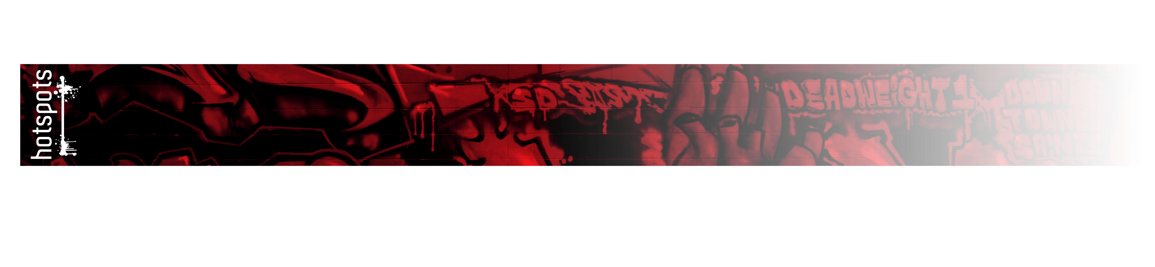
A third from Hotspots, a show all about exploring and finding local places in St. Catharines. From eateries to hobby stores, the program was about bringing student friendly places to light.
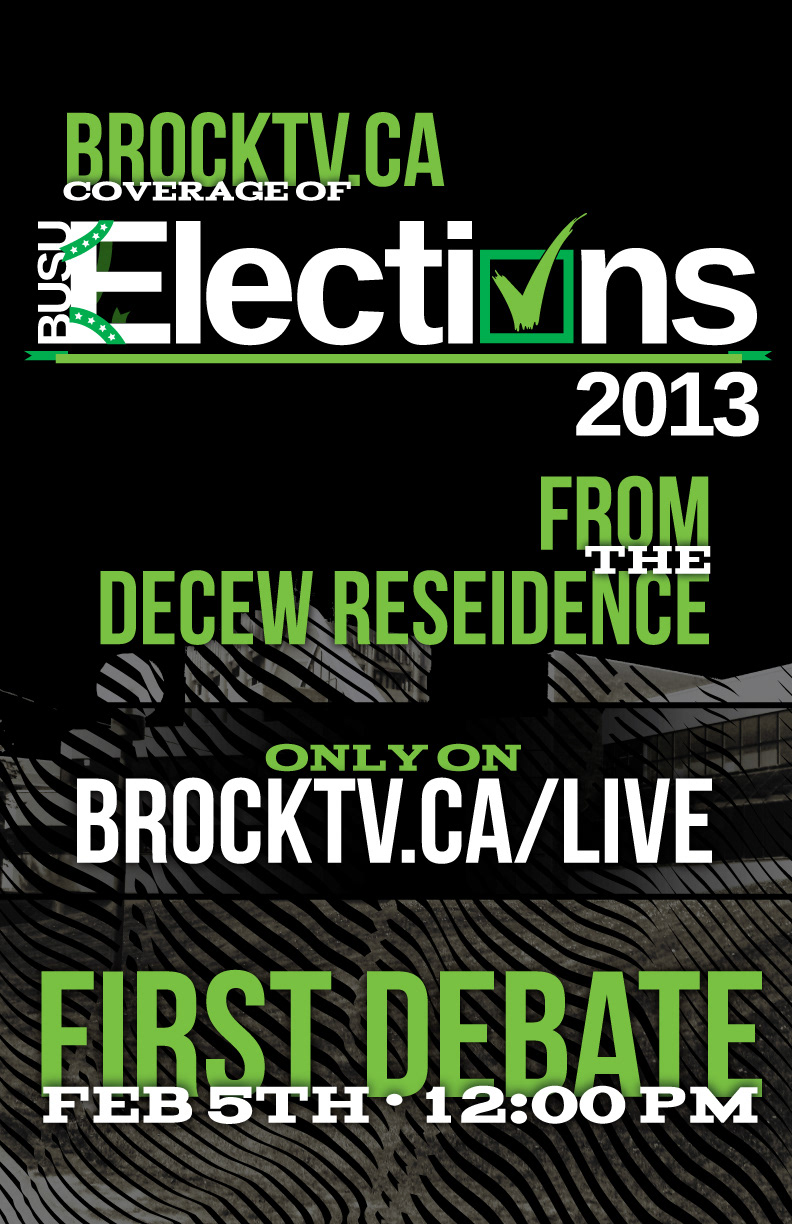
Every year Brock University students undergo an electoral process, electing executives and councillors for effectively governing the student body and managing student opinion. This is one of the Livestream posters.
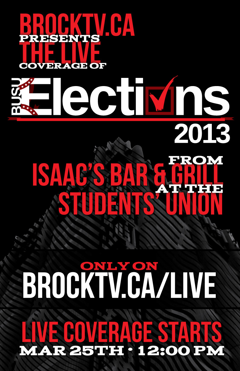
A Livestream poster from the BrockTV election coverage. On top of posters, I worked on the opener, thirds and results imagery.

A great giveaway of 2012-2013 was a mint container. This was the imagery for the top face of it, and the visual implications are all on purpose. #studentlife

The idea of Tip Of The Tower was to report news like The Daily Show, but with a Ron Burgandy meets Nardwuar twist. This is a poster for the show.
The year at BrockTV also allowed me to do tons of one off posters, this was one of them.

A huge thing for 2012-13 was rebranding not just the logo but the entire digital face. Which meant reworking the website. I can't say I was 100% happy with it, but I did love aspects of the design. #improvingforever
Thank you very much for checking my work out! Among other things 2012-2013 was a very fun year, with lots of learning opportunities and projects that I really enjoyed.


